The Paris-based startup founded in 2009 once declared: “We focus on the visual potential of Pearltrees to let people dive deeply into their interests and nearly feel them”. Their product, offering a digital curation tool, was unique because of the visual interface voluntareely original: links and folders symbolized by rounded pearls attached together like the branches of a tree. Today, pearls and trees have disappeared to make room for a brand new and larger organisation tool.

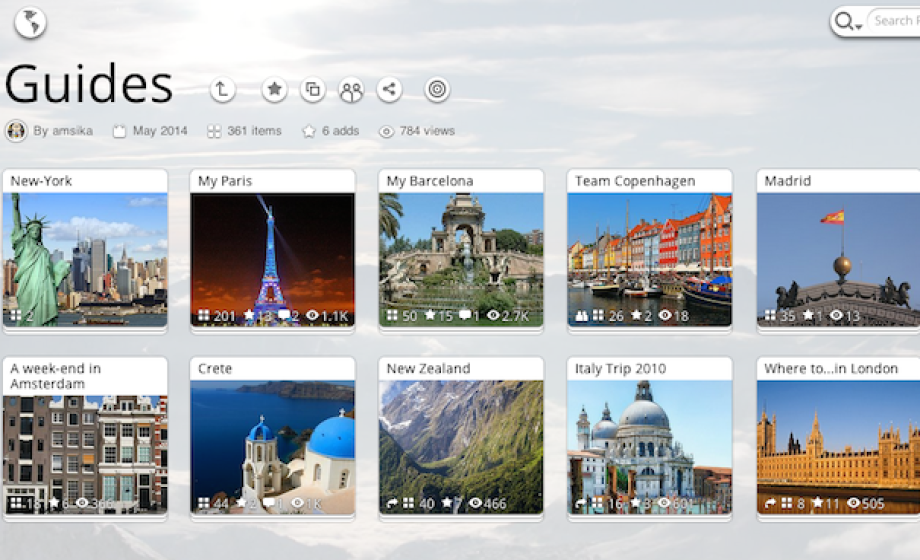
Two years ago, everyone wanted to build products around “curation” and “interest graph”. Today the keywords have shifted to “collaborative SaaS tool” and “organizing data”. Pearltrees, who has raised €8,5 million in two rounds, is renewing itself to match the new trends by releasing a new version focused on organization of collections in a more “obvious” way. Pearltrees 2.0’s coolest feature is that you can literally curate anything, from a URL to a picture to a paragraph to a document to a quote. Everything is drag-and-dropable – I wouldn’t be surprise if you could soon drag-and-drop your thoughts on Pearltrees as they do with Harry Potter’s pensieve. The new interface is very similar to what everyone is used to on any computer: folders are organized in a (regular) tree structure. Free users will get 1Go of storage space. Two premium plans can give you access to more storage space (25Go and 100Go – as a comparison, Dropbox gives you 2Go for free and 100Go for premium individual users), backup, private and customization features.
The other main improvement lies in the shift from Flash to HTML5 technology, which will make a huge difference for all those who never update their Flash player – and those who think Flash is “so 2011”.
Why giving up the core of the product, after 4,5 years of existence and 1,7 million users? Mainly because the format was hindering the virality of users’ collections of pearls. The reputation of the startup has indeed dropped from hopes to become “the new Facebook” in 2012 to basically a nobody in 2014. Having nearly 2 million users is an impressive figure, especially for a French social app; yet the team was shy on giving out the numbers that actually matter such as active users, paying users and retention rate – which, in itself, tells a lot about the reality of those numbers.
Pearltrees’ new vision is to provide an organizational tool for everything, whereas other services consider your digital life divided in silos: Pinterest for pictures, Dropbox for files, Evernote for notes, etc. The “social” aspect has not completely disappeared from their strategy: the discovery features are also reinforced in the new version. If you are a teacher who wants to build collaborative projects with your students, a group of friends who wants to make a list of your favorite bars and restaurants or a journalist who wants to use a technology watch tool, the new Pearltrees seems to work fine.
The only drawback is that the design of the app has not changed much and looks a little old to create a real agreeable experience. Having a beautiful design is no detail for a startup that aspires to reach 6 billion users: would Dropbox or Pinterest be so successful without their super-clean and modern interface? Internet users are so hard to please today that it is rarely possible to get traction with “only” a high-quality product.

