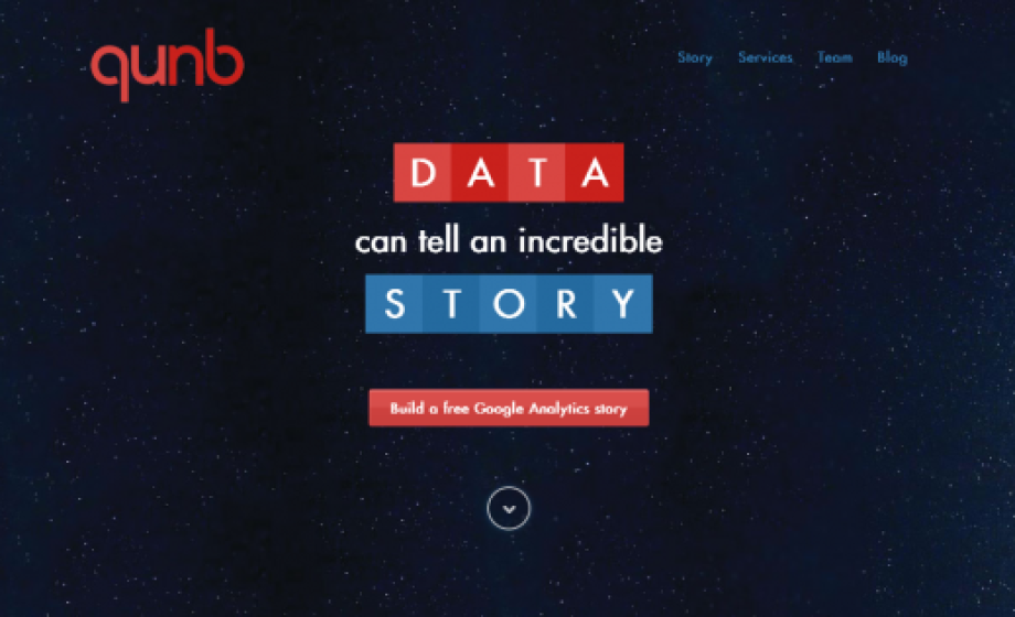
This week, data visualization startup qunb announced a new layout of its service, which once claimed to be the Youtube of data. Today, the service, which just recently finished the 3-month Techstars Boston program (SEE: 5 Things I learned at TechStars by qunb CEO Cyrille Vincey), now offers a very useful demo of their visualizatiion capabilities, by allowing any user to visualize their Google Analytics data in minutes.
https://twitter.com/qunb/status/380330408602517504
While I haven’t yet used the service to visualize data beyond the quick Google Analytics test, the capacity to visualize data in a meaningful and efficient way is becoming more necessary. The modern technology company is storing data on almost every aspect of its company’s performance, its product’s performance, its users’ habits, and so much more; the problem today isn’t knowing what’s going on, it’s being able to step back from every single datapoint and see the big picture.
Other data visualization players in Europe include Infogram, which focuses on creating data-packed graphics called infographics, usually used for marketing purposes by companies looking to announce growth metrics. qunb focuses more on creating meaningful graphs, likely more for internal use than external use, though it is clear that both services could be used for both purposes.
What do you use to visualize your data? Let us know in the comments below.

